Be yourself; Everyone else is already taken.
— Oscar Wilde.
This is the first post on my new blog. I’m just getting this new blog going, so stay tuned for more. Subscribe below to get notified when I post new updates.
Be yourself; Everyone else is already taken.
— Oscar Wilde.
This is the first post on my new blog. I’m just getting this new blog going, so stay tuned for more. Subscribe below to get notified when I post new updates.
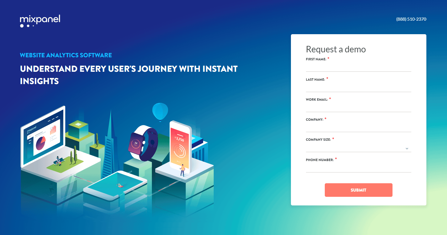
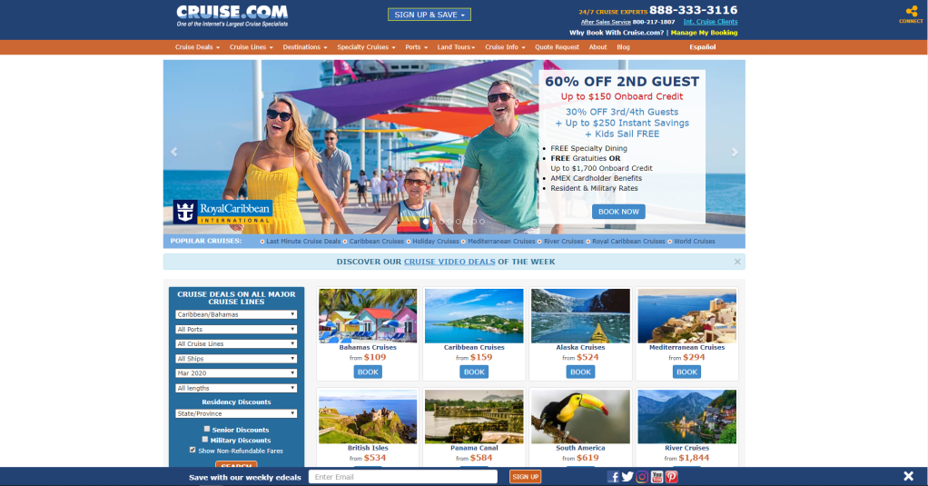
We have all seen or used landing pages maybe without even realizing what it was. Landing pages are here for the soul purpose of directing you to a “call to action” or something that you get involved with. What makes this different than filling out a simple form on a site is that a landing page is a page separated from the main site. Some people don’t take the design as seriously as they should because it isn’t apart of the “main site”. But in fact it is extremely important. As seen above of the poorly made landing site it isn’t appealing and makes it feel not “trustworthy”. When working with the design/creation of a landing page you want to have an understanding of what matters and why. Thankfully, I’ll be providing an example and breaking down the key parts. That example will be Shopify.
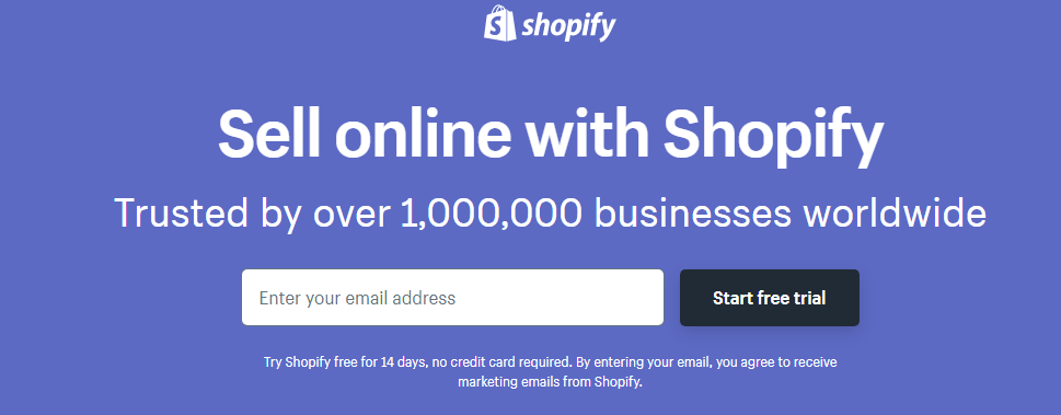
Within a selling proposition we want to have a common format. The main headline, supporting headline, reinforcement statement, and closing argument. If you exclude the email query and the trial button everything falls right into line. These are effective because it allows you to know who it’s by, what it does, why you should choose it, and seals the deal by giving a deal. That deal being something to give you the extra push to use their services. This is one of the first steps to a “good” landing page.
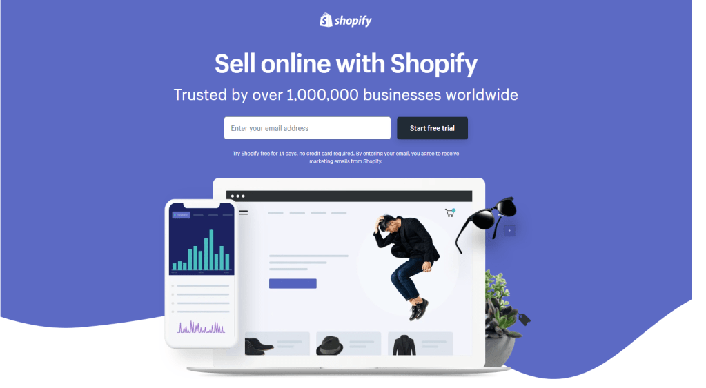
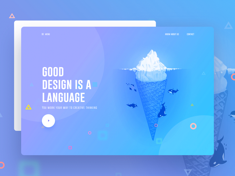
Most every landing page implements a solid hero image. This being the illustration behind the selling proposition we just talked about. Hero images are effective because they allow for text and items to be overlay-ed and also gives a much more professional look to your landing page.
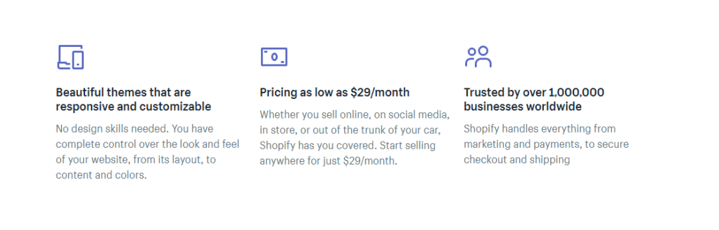
It is good within a landing page to show what you offer in more detail. This being what you get extra and what the product already provides. For this site we have:
This allows for the consumer to feel better or be more persuaded to use your service.
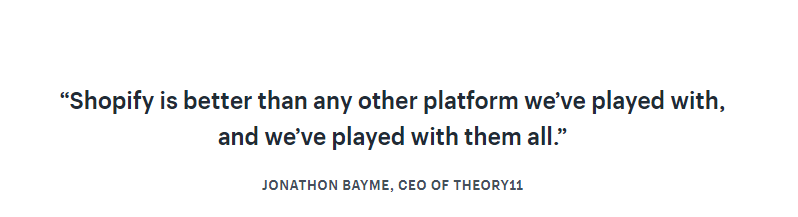
Proof allows for the consumer to trust the company. Having proof such as testimonials, ratings, and reviews can benefit your landing page greatly. This can allow for customers who know certain brands or people that left reviews to create a relationship within the site. Thus bringing activity to the service you provide.
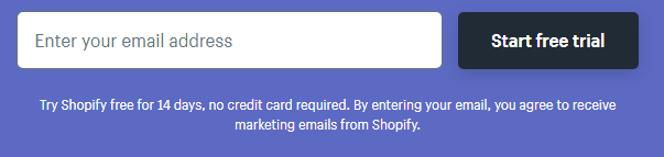
Every landing page focuses on the main goal of getting you to use it’s service whatever it may be. This site in particular wants you to start your free trial. What benefits them is the fact that in 14 days your trial ends. That being the case, if you enjoyed the service you will want to continue to use it and that is where they make their money. So the ultimate goal is to get you started and hooked which is a common marketing tactic you see in many sites.
Using these items within your landing page will enhance your landing page and get your consumers to not just look at the page but engage in it. If you liked the blog, I highly encourage you to visit some of my other website posts such as:
You know as well as I do that not every designer makes every single item within a website. Designers pull from, use, and download all sorts of media from many places. If you are custom making everything you put into a design, Good for you! But that is most likely taking up a lot of precious time that could be spent else where. Let’s look as some of the resources that you can use for some of the more popular design elements and even a trend.
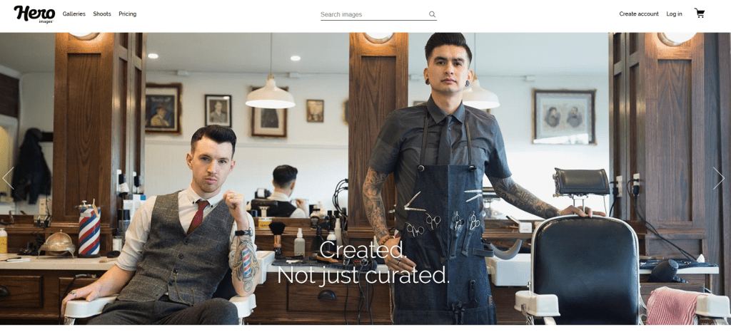
There are plenty of sites for getting images and specifically hero images since those images are very large and are always in dire need of good quality. Some important factors of getting images are making sure they are not copyrighted and ensuring you grabbed the right size. 2 resources that could save you a bit of time would be using: https://heroimages.com/ for hero images or https://www.shutterstock.com/ to find tons and tons of free to use images after making an account.
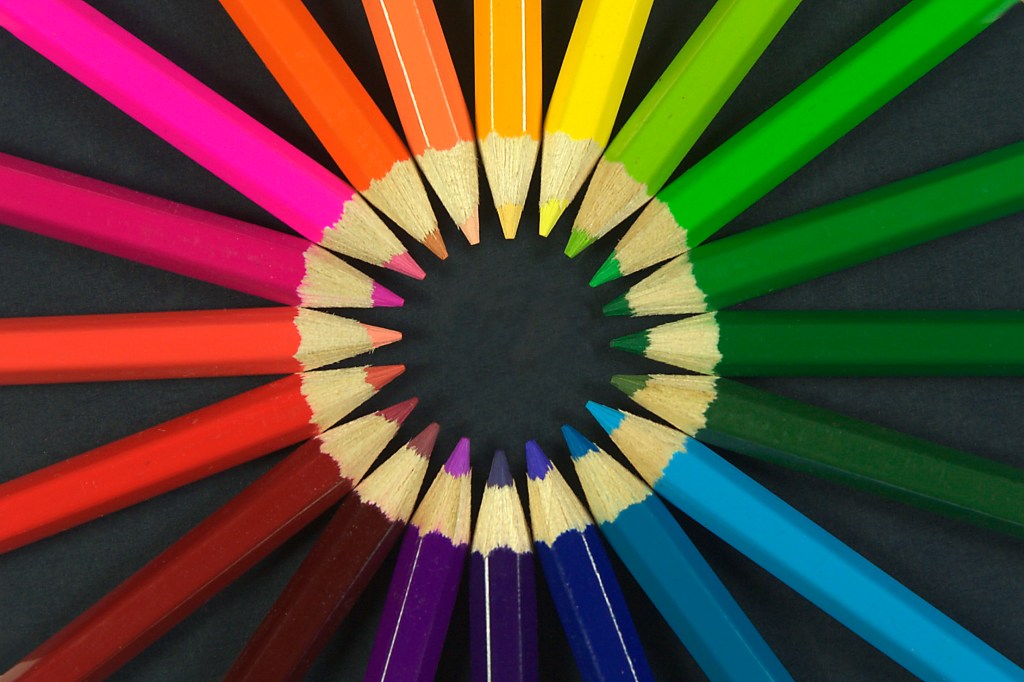
Colors are needed for any customization within your design and I don’t think these need much explaining. Gradients are used some in modern website design and having a set of colors for your theme can change the overall feel and appearance of your website. So it is really nice when you don’t have to go searching for that information yourself. Some prime resources to help get colors are https://color.adobe.com/create which in my opinion is the best option since it has a very easy to use automated wheel. Some others are https://coolors.co/ and https://colorhunt.co/. Very useful in regards to finding lots of random color schemes.
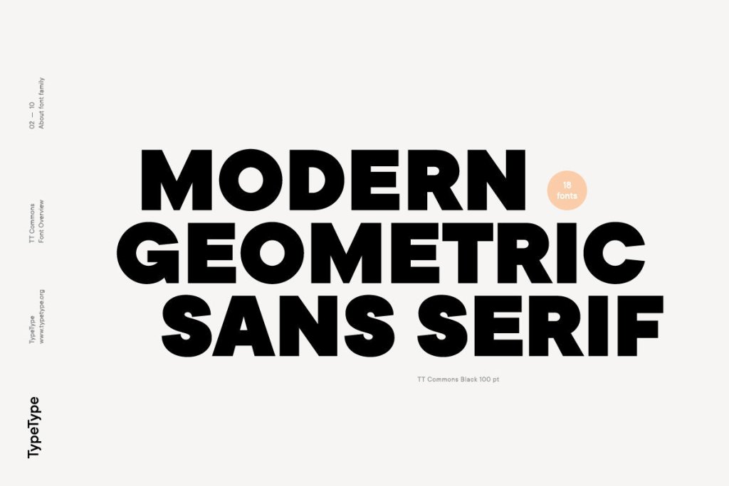
A modern trend for today is using simpler yet larger fonts and it is very important to use web-safe fonts so that your website is not only appealing but it is faster since every computer can load that font. If you use custom fonts you are risking site speed. It is nice to be able to use resources that will help give you those web safe fonts you need. The best choice for this would be to use https://fonts.google.com/. This is straight from Google itself which ensures font safety. Another very good resource is https://fonts.adobe.com/fonts.
Being aware of when it is good to be custom and good to use your resources is very valuable. It can help show you more ways to utilize trends efficiently and up your design game. If you want a better understanding for trends you can find them in my previous blog: https://aaronwilson.school.blog/2020/01/16/the-2020-web-design-trends-you-should-be-looking-at/
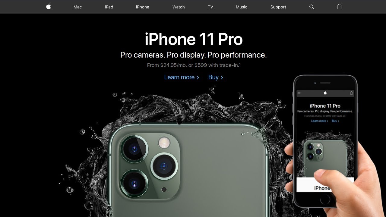
You probably look through business websites every single day and never have a single thought about what you are suddenly drawn to or click. Matter of fact you most likely clicked this blog because of a title that questions your awareness. Design trends are the exact same way. They are built into things to create appeal and modernize today’s websites. Businesses use these all the time to make their website more attractive to today’s type of people. Let’s look at some examples.
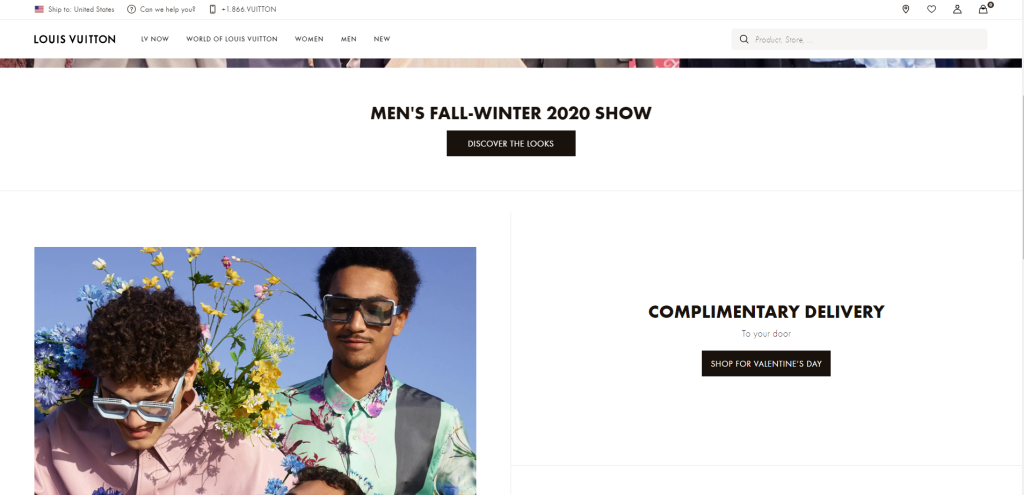
You can see a prime example in the heading above this paragraph. Some of the most popular companies use this type of design trend for a pretty simple reason. They are easy to read, easy to contrast on a background, and they also get rid of any “claustrophobia” you may feel when trying to navigate a website. It creates a sense of freedom and the feel of new.
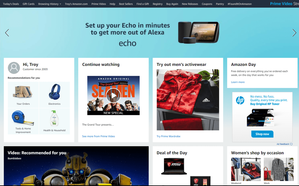
Grid Layout is by far one of the most used design trends when it comes to business and shopping. Amazon uses this to promote a lot of different types of merchandise on one page and the grid layout makes it easy to navigate, view, and click. This allows consumers like me and you to get recommendations off the bat that would be good for us based on our shopping history. The grid just effectively communicates info.
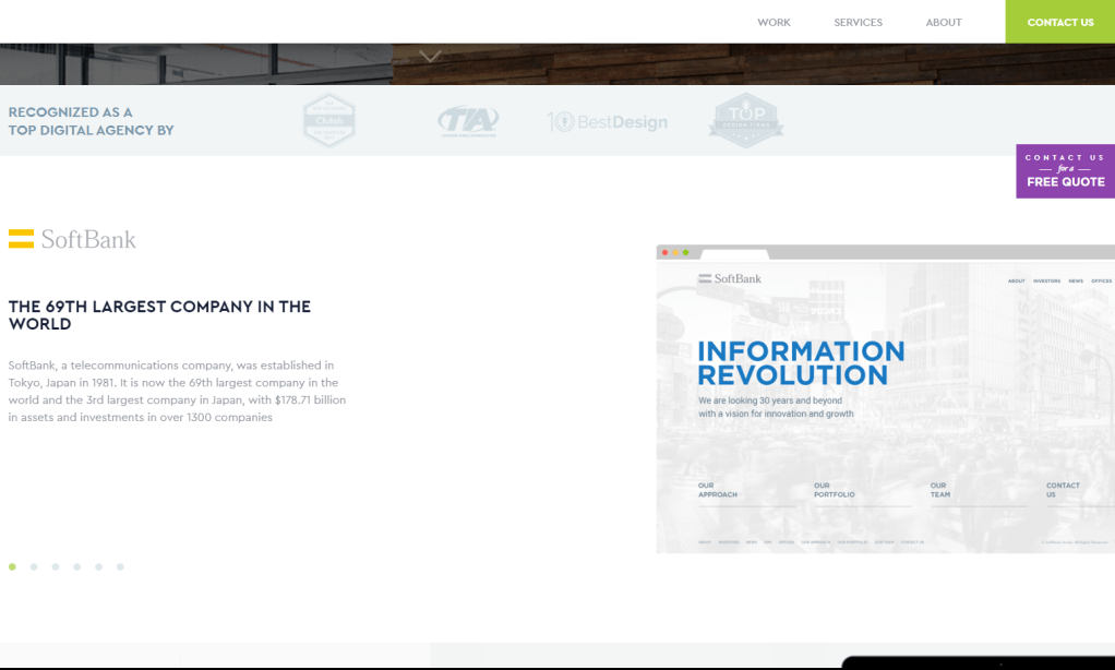
This in my opinion should not continue to be a design trend for 2020 as it seems to get in the way. Fixed links or menus are items that are on the sides of your page and scroll with you at all times. The “Contact Us for a Free Quote” on the side of the example above is a fixed links. No matter where you go it will always stay on the page. This renders it a little annoying and there is no way to get rid of it if you aren’t interested.
There are many more design trends you can find all over some even just by breaking down a website to it’s key parts. If you want to find out more about website design trends you can go to these sources:
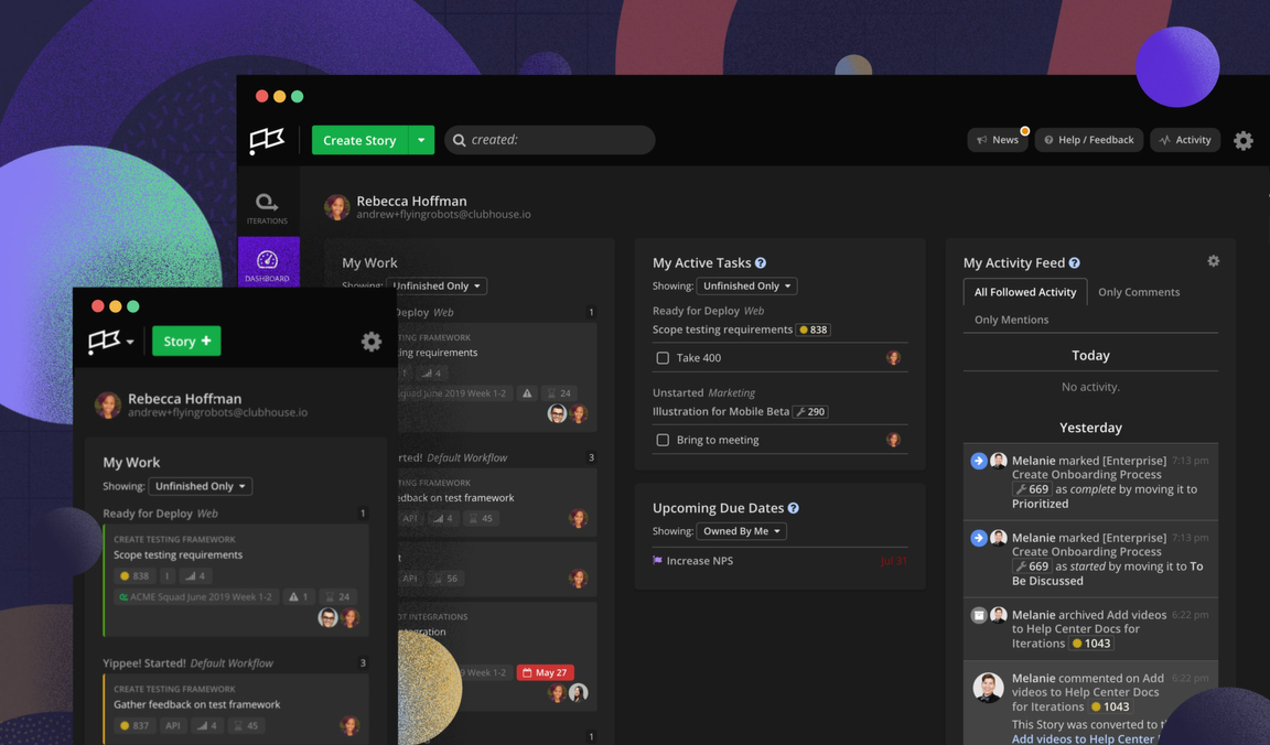
As everyone of us being the obvious users of the web. We have seen a lot of website design trends and well know that not every one stays. The new year is now and that allows for new change or at least new thinking towards change. That being the case, we have already begun to accumulate new trends that are very common in the newest sites. Those new trends being, Dark Mode, Luminous Color Schemes, 3-D elements, and Abstract Illusions. Let’s dig a little deeper into what they are and encompass.
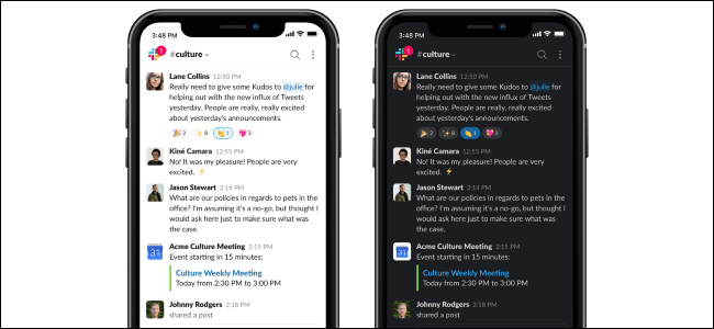
If you aren’t familiar with what Dark Mode is, It is the ability to change all the white background in your website to grey or black giving you less strain on the eyes and actually more readability. It inverts the color of all the text as well making everything else opposite to the dark background. Dark Mode has actually been around for a good while. I’ve used dark mode on YouTube’s website for almost 2 years. The reason this trend is for 2020 is because it has grown on more and more sites exponentially.
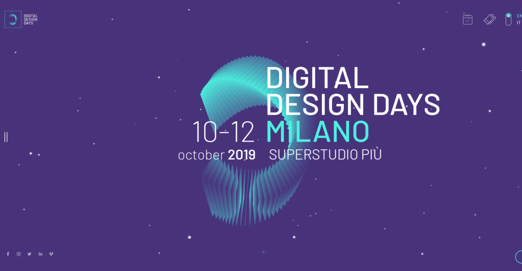
This trend is most certainly upcoming for 2020 as I haven’t seen near as much of it. This trend known as Luminous Color Schemes encompasses using high saturation in darker tones to create a light-luminous effect that almost jumps out of the screen. The design speaks for itself below.
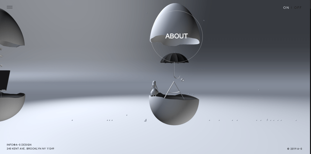
If you read the heading this is exactly what it says it is. This uses 3-Dimensional interface to not only give the website good design but allows user interface to look throughout the website and interact with it’s features. It is much more complex for design so you don’t see it as often. It is also very hard to make quality 3-D but some websites executed it well. ex: https://a-0.design/
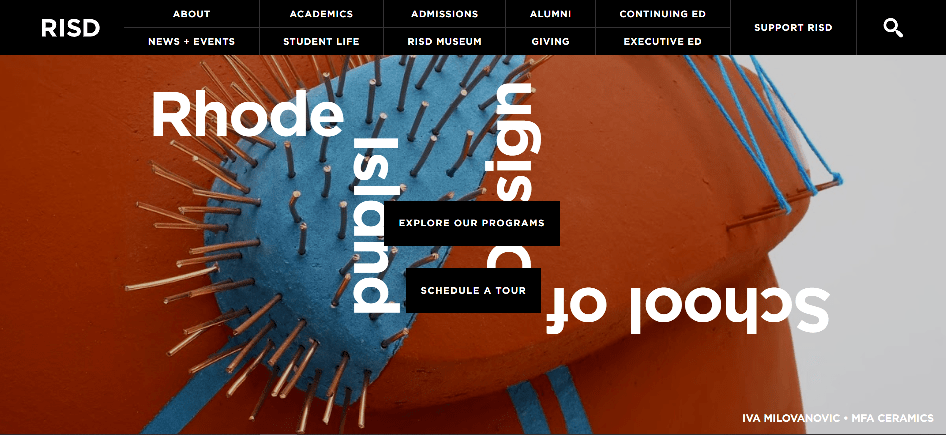
Another new trend is Abstract Illustration which in my personal opinion isn’t the best. It focuses on art and design that is not regularly formatted and is always out of the ordinary. This trend has grown as lots of new designers and artists come in and even google promotes this type of design.
If you want to find out about even more upcoming and possibly common trends to be you can click –here- or -here- . This could help prepare your awareness towards what could be your day to day in the upcoming months or years.
Good afternoon! I am so excited to be in this class to learn a lot more about website design. I drove 45 min just to be here. I am burning with passion and am fully dedicated to this class and doing well in it. I do have a couple of objectives throughout this class.
This is an example post, originally published as part of Blogging University. Enroll in one of our ten programs, and start your blog right.
You’re going to publish a post today. Don’t worry about how your blog looks. Don’t worry if you haven’t given it a name yet, or you’re feeling overwhelmed. Just click the “New Post” button, and tell us why you’re here.
Why do this?
The post can be short or long, a personal intro to your life or a bloggy mission statement, a manifesto for the future or a simple outline of your the types of things you hope to publish.
To help you get started, here are a few questions:
You’re not locked into any of this; one of the wonderful things about blogs is how they constantly evolve as we learn, grow, and interact with one another — but it’s good to know where and why you started, and articulating your goals may just give you a few other post ideas.
Can’t think how to get started? Just write the first thing that pops into your head. Anne Lamott, author of a book on writing we love, says that you need to give yourself permission to write a “crappy first draft”. Anne makes a great point — just start writing, and worry about editing it later.
When you’re ready to publish, give your post three to five tags that describe your blog’s focus — writing, photography, fiction, parenting, food, cars, movies, sports, whatever. These tags will help others who care about your topics find you in the Reader. Make sure one of the tags is “zerotohero,” so other new bloggers can find you, too.
Have a WordPress.com account? Log in now.

